android实现Materia Design风格APP(三):部分Materia Design风格的控件介绍二_@bindview(r2.id.drawer_layout) drawerlayout mdrawe-程序员宅基地
技术标签: UI动画类 android Materia Design android实现Materia Design风格APP
本篇大部分内容学习自第一行代码第二版加上部分自己理解。介绍了,DrawerLayout、NavigationView、NestedScrollView、AppBarLayout、CardView、SwipeRefreshLayout、CollapsingToolbarLayout七个控件,会的请自行跳过。
首先需要在build.gradle中依赖:
implementation 'com.android.support:design:28.0.0'
implementation 'de.hdodenhof:circleimageview:2.1.0'
implementation 'com.android.support:cardview-v7:28.0.0'
1.DrawerLayout
滑动菜单,第一个布局为主内容,第二个布局为菜单布局,可以设置两个菜单布局分别指定layout_gravity为start和end设置左右滑出不同布局的菜单。
xml布局代码:
<?xml version="1.0" encoding="utf-8"?>
<android.support.v4.widget.DrawerLayout
    xmlns:android="http://schemas.android.com/apk/res/android"
    xmlns:app="http://schemas.android.com/apk/res-auto"
    xmlns:tools="http://schemas.android.com/tools"
    android:layout_width="match_parent"
    android:layout_height="match_parent"
    tools:context=".Main2Activity">

    <android.support.design.widget.CoordinatorLayout
        android:id="@+id/root"
        android:layout_width="match_parent"
        android:layout_height="match_parent">

        <!--定义theme指定toolBar中的子view的主题,popupTheme指定toolBar隐藏的menu打开时的主题-->
        <android.support.v7.widget.Toolbar
            android:id="@+id/toolBar"
            android:layout_width="match_parent"
            android:layout_height="?attr/actionBarSize"
            android:theme="@style/ThemeOverlay.AppCompat.Dark.ActionBar"
            app:popupTheme="@style/ThemeOverlay.AppCompat.Light"
            android:background="@color/colorPrimary"/>

        <android.support.design.widget.FloatingActionButton
            android:id="@+id/fab"
            android:layout_width="wrap_content"
            android:layout_height="wrap_content"
            android:src="@drawable/ic_delete"
            android:layout_gravity="end|bottom"
            android:layout_margin="16dp"/>
    </android.support.design.widget.CoordinatorLayout>

    <!--注意DrawerLayout的菜单布局一定要指定layout_gravity,否则收不回去,且只能指定左右滑出,不能是上下,-->
    <!--也不能指定多个左右-->
    <TextView
        android:layout_width="match_parent"
        android:layout_height="match_parent"
        android:text="@string/app_name"
        android:layout_gravity="start"
        android:gravity="center"
        android:background="@color/white"/>

    <TextView
        android:layout_width="match_parent"
        android:layout_height="match_parent"
        android:text="end"
        android:layout_gravity="end"
        android:gravity="center"
        android:background="@color/white"/>
</android.support.v4.widget.DrawerLayout>
2.NavigationView
Google按照Materia Design设计提供的滑动菜单中的菜单布局。
xml布局代码:
<?xml version="1.0" encoding="utf-8"?>
<android.support.v4.widget.DrawerLayout
    android:id="@+id/drawer_layout"
    xmlns:android="http://schemas.android.com/apk/res/android"
    xmlns:app="http://schemas.android.com/apk/res-auto"
    xmlns:tools="http://schemas.android.com/tools"
    android:layout_width="match_parent"
    android:layout_height="match_parent"
    tools:context=".Main2Activity">

    <android.support.design.widget.CoordinatorLayout
        android:id="@+id/root"
        android:layout_width="match_parent"
        android:layout_height="match_parent">

        <!--定义theme指定toolBar中的子view的主题,popupTheme指定toolBar隐藏的menu打开时的主题-->
        <android.support.v7.widget.Toolbar
            android:id="@+id/toolBar"
            android:layout_width="match_parent"
            android:layout_height="?attr/actionBarSize"
            android:theme="@style/ThemeOverlay.AppCompat.Dark.ActionBar"
            app:popupTheme="@style/ThemeOverlay.AppCompat.Light"
            android:background="@color/colorPrimary"/>

        <android.support.design.widget.FloatingActionButton
            android:id="@+id/fab"
            android:layout_width="wrap_content"
            android:layout_height="wrap_content"
            android:src="@drawable/ic_delete"
            android:layout_gravity="end|bottom"
            android:layout_margin="16dp"/>
    </android.support.design.widget.CoordinatorLayout>

    <!--headerLayout指定头布局,menu指定头布局下的菜单布局-->
    <android.support.design.widget.NavigationView
        android:layout_width="match_parent"
        android:layout_height="match_parent"
        android:layout_gravity="start"
        app:headerLayout="@layout/nav_header"
        app:menu="@menu/nav_menu"/>
</android.support.v4.widget.DrawerLayout>
java代码
public class Main2Activity extends AppCompatActivity {

    @BindView(R.id.fab)
    FloatingActionButton fab;//悬浮按钮
    @BindView(R.id.toolBar)
    Toolbar toolbar;//toolBar
    @BindView(R.id.drawer_layout)
    DrawerLayout drawerLayout;//滑动菜单

    @Override
    protected void onCreate(Bundle savedInstanceState) {
        super.onCreate(savedInstanceState);
        setContentView(R.layout.activity_main2);
        ButterKnife.bind(this);

        //设置toolBar的title文字
        toolbar.setTitle("ActionBar");
        //将toolBar设置为actionBar
        setSupportActionBar(toolbar);
        ActionBar actionBar = getSupportActionBar();
        //显示返回按钮
        actionBar.setDisplayHomeAsUpEnabled(true);
        //设置返回按钮图标
        actionBar.setHomeAsUpIndicator(R.drawable.ic_menu);

        //设置悬浮按钮点击事件
        fab.setOnClickListener(new View.OnClickListener() {
            @Override
            public void onClick(View v) {

                //构建带点击事件的Snakebar
                Snackbar.make(fab, "Would you want to delete the first item?", Snackbar.LENGTH_SHORT)
                        .setAction("确定", new View.OnClickListener() {
                            @Override
                            public void onClick(View v) {

                                Snackbar.make(fab, "Delete Successful.", Snackbar.LENGTH_SHORT).show();
                            }
                        }).show();
            }
        });
    }

    //设置toolBar上的menu
    @Override
    public boolean onCreateOptionsMenu(Menu menu) {
        getMenuInflater().inflate(R.menu.toolbar, menu);
        return true;
    }

    //点击菜单栏按钮的操作事件
    @Override
    public boolean onOptionsItemSelected(MenuItem item) {
        if (item.getItemId() == android.R.id.home) {
            drawerLayout.openDrawer(GravityCompat.START);
        }
        return true;
    }
}
3.NestedScrollView+CoordinatorLayout+AppBarLayout+ToolBar
NestedScrollView加强版的ScrollView,支持嵌套滑动,你可以把它就当做ScrollView使用。而Materia Design之所会推出这个滑动布局,一般是配合AppBarLayout+ToolBar来使用的,配合我上一篇文章说道的CoordinateLayout的behavior属性,可以实现ToolBar随着NestedScrollView的向上、向下滑动来进行显示隐藏效果。
AppBarLayout继承自LinearLayout,你可以把它理解为一个垂直方向的LinearLayout,它可以让你定制当某个可滚动View的滚动手势发生变化时,其内部的子View实现何种动作。内部的子View通过在布局中加app:layout_scrollFlags设置执行的动作,值分别为:scroll :子view会跟随滚动事件一起滚动;enterAlways :只要屏幕下滑,view就会立即拉下出来;snap :如果控件下拉了75%的高度,就会自动展开,如果只有25%显示,就会反弹回去关闭;exitUntilCollapsed :当scrollview滑到订部,再将子view折叠起来;
需要注意的是AppBarLayout必须是CoordinatorLayout的子view才有效果。
效果图:注意标题栏的显示隐藏以及出现超过75%时自动展开,小于25%时自动回弹的效果。
xml代码:
<?xml version="1.0" encoding="utf-8"?>
<android.support.v4.widget.DrawerLayout
android:id="@+id/drawer_layout"
xmlns:android="http://schemas.android.com/apk/res/android"
xmlns:app="http://schemas.android.com/apk/res-auto"
xmlns:tools="http://schemas.android.com/tools"
android:layout_width="match_parent"
android:layout_height="match_parent"
tools:context=".Main2Activity">
<android.support.design.widget.CoordinatorLayout
android:id="@+id/root"
android:layout_width="match_parent"
android:layout_height="match_parent">
<android.support.design.widget.AppBarLayout
android:layout_width="match_parent"
android:layout_height="wrap_content">
<!--定义theme指定toolBar中的子view的主题,popupTheme指定toolBar隐藏的menu打开时的主题-->
<android.support.v7.widget.Toolbar
android:id="@+id/toolBar"
android:layout_width="match_parent"
android:layout_height="?attr/actionBarSize"
android:theme="@style/ThemeOverlay.AppCompat.Dark.ActionBar"
app:popupTheme="@style/ThemeOverlay.AppCompat.Light"
android:background="@color/colorPrimary"
app:layout_scrollFlags="scroll|enterAlways|snap"/>
</android.support.design.widget.AppBarLayout>
<android.support.v4.widget.NestedScrollView
android:layout_width="match_parent"
android:layout_height="match_parent"
app:layout_behavior="@string/appbar_scrolling_view_behavior">
<FrameLayout
android:layout_width="match_parent"
android:layout_height="match_parent">
<TextView
android:layout_width="match_parent"
android:layout_height="1200dp"
android:text="content"
android:gravity="center"
android:background="@color/colorAccent"/>
</FrameLayout>
</android.support.v4.widget.NestedScrollView>
<android.support.design.widget.FloatingActionButton
android:id="@+id/fab"
android:layout_width="wrap_content"
android:layout_height="wrap_content"
android:src="@drawable/ic_delete"
android:layout_gravity="end|bottom"
android:layout_margin="16dp"/>
</android.support.design.widget.CoordinatorLayout>
<!--headerLayout指定头布局,menu指定头布局下的菜单布局-->
<android.support.design.widget.NavigationView
android:layout_width="match_parent"
android:layout_height="match_parent"
android:layout_gravity="start"
app:headerLayout="@layout/nav_header"
app:menu="@menu/nav_menu"/>
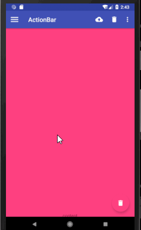
</android.support.v4.widget.DrawerLayout>4.CardView
卡片布局,可以设置圆角矩形背景和阴影让布局显得更加立体。

xml代码:
<?xml version="1.0" encoding="utf-8"?>
<android.support.v4.widget.DrawerLayout
    android:id="@+id/drawer_layout"
    xmlns:android="http://schemas.android.com/apk/res/android"
    xmlns:app="http://schemas.android.com/apk/res-auto"
    xmlns:tools="http://schemas.android.com/tools"
    android:layout_width="match_parent"
    android:layout_height="match_parent"
    tools:context=".Main2Activity">

    <android.support.design.widget.CoordinatorLayout
        android:id="@+id/root"
        android:layout_width="match_parent"
        android:layout_height="match_parent">

        <android.support.design.widget.AppBarLayout
            android:layout_width="match_parent"
            android:layout_height="wrap_content">
        <!--定义theme指定toolBar中的子view的主题,popupTheme指定toolBar隐藏的menu打开时的主题-->
        <android.support.v7.widget.Toolbar
            android:id="@+id/toolBar"
            android:layout_width="match_parent"
            android:layout_height="?attr/actionBarSize"
            android:theme="@style/ThemeOverlay.AppCompat.Dark.ActionBar"
            app:popupTheme="@style/ThemeOverlay.AppCompat.Light"
            android:background="@color/colorPrimary"
            app:layout_scrollFlags="scroll|enterAlways|snap"/>
        </android.support.design.widget.AppBarLayout>

        <android.support.v4.widget.NestedScrollView
            android:layout_width="match_parent"
            android:layout_height="match_parent"
            app:layout_behavior="@string/appbar_scrolling_view_behavior">
            <FrameLayout
                android:layout_width="match_parent"
                android:layout_height="match_parent">

                <!--cardCornerRadius设置圆角矩形的四个角弧度,elevation设置阴影效果-->
                <android.support.v7.widget.CardView
                    android:layout_width="match_parent"
                    android:layout_height="wrap_content"
                    android:layout_margin="20dp"
                    app:cardCornerRadius="10dp"
                    android:elevation="8dp">

                    <TextView
                        android:layout_width="match_parent"
                        android:layout_height="1200dp"
                        android:text="content"
                        android:gravity="center"
                        android:background="@color/yellow"/>
                </android.support.v7.widget.CardView>
            </FrameLayout>

        </android.support.v4.widget.NestedScrollView>

        <android.support.design.widget.FloatingActionButton
            android:id="@+id/fab"
            android:layout_width="wrap_content"
            android:layout_height="wrap_content"
            android:src="@drawable/ic_delete"
            android:layout_gravity="end|bottom"
            android:layout_margin="16dp"/>
    </android.support.design.widget.CoordinatorLayout>

    <!--headerLayout指定头布局,menu指定头布局下的菜单布局-->
    <android.support.design.widget.NavigationView
        android:layout_width="match_parent"
        android:layout_height="match_parent"
        android:layout_gravity="start"
        app:headerLayout="@layout/nav_header"
        app:menu="@menu/nav_menu"/>
</android.support.v4.widget.DrawerLayout>
5.SwipeRefreshLayout
下拉刷新控件,使用很简单,把它嵌套在你想下拉刷新的布局外面就可以了。

xml布局:
<?xml version="1.0" encoding="utf-8"?>
<android.support.v4.widget.DrawerLayout
    android:id="@+id/drawer_layout"
    xmlns:android="http://schemas.android.com/apk/res/android"
    xmlns:app="http://schemas.android.com/apk/res-auto"
    xmlns:tools="http://schemas.android.com/tools"
    android:layout_width="match_parent"
    android:layout_height="match_parent"
    tools:context=".Main2Activity">

    <android.support.design.widget.CoordinatorLayout
        android:id="@+id/root"
        android:layout_width="match_parent"
        android:layout_height="match_parent">

        <android.support.design.widget.AppBarLayout
            android:layout_width="match_parent"
            android:layout_height="wrap_content">
            <!--定义theme指定toolBar中的子view的主题,popupTheme指定toolBar隐藏的menu打开时的主题-->
            <android.support.v7.widget.Toolbar
                android:id="@+id/toolBar"
                android:layout_width="match_parent"
                android:layout_height="?attr/actionBarSize"
                android:theme="@style/ThemeOverlay.AppCompat.Dark.ActionBar"
                app:popupTheme="@style/ThemeOverlay.AppCompat.Light"
                android:background="@color/colorPrimary"
                app:layout_scrollFlags="scroll|enterAlways|snap"/>
        </android.support.design.widget.AppBarLayout>

        <!--下拉刷新控件-->
        <android.support.v4.widget.SwipeRefreshLayout
            android:id="@+id/swipe_refresh"
            android:layout_width="match_parent"
            android:layout_height="match_parent"
            app:layout_behavior="@string/appbar_scrolling_view_behavior">

            <android.support.v4.widget.NestedScrollView
                android:layout_width="match_parent"
                android:layout_height="match_parent">
                <FrameLayout
                    android:layout_width="match_parent"
                    android:layout_height="match_parent">

                    <!--cardCornerRadius设置圆角矩形的四个角弧度,elevation设置阴影效果-->
                    <android.support.v7.widget.CardView
                        android:layout_width="match_parent"
                        android:layout_height="wrap_content"
                        android:layout_margin="20dp"
                        app:cardCornerRadius="10dp"
                        android:elevation="8dp">

                        <TextView
                            android:layout_width="match_parent"
                            android:layout_height="1200dp"
                            android:text="content"
                            android:gravity="center"
                            android:background="@color/yellow"/>
                    </android.support.v7.widget.CardView>
                </FrameLayout>

            </android.support.v4.widget.NestedScrollView>
        </android.support.v4.widget.SwipeRefreshLayout>

        <android.support.design.widget.FloatingActionButton
            android:id="@+id/fab"
            android:layout_width="wrap_content"
            android:layout_height="wrap_content"
            android:src="@drawable/ic_delete"
            android:layout_gravity="end|bottom"
            android:layout_margin="16dp"/>
    </android.support.design.widget.CoordinatorLayout>

    <!--headerLayout指定头布局,menu指定头布局下的菜单布局-->
    <android.support.design.widget.NavigationView
        android:layout_width="match_parent"
        android:layout_height="match_parent"
        android:layout_gravity="start"
        app:headerLayout="@layout/nav_header"
        app:menu="@menu/nav_menu"/>
</android.support.v4.widget.DrawerLayout>
java代码:
public class Main2Activity extends AppCompatActivity {

    @BindView(R.id.fab)
    FloatingActionButton fab;//悬浮按钮
    @BindView(R.id.toolBar)
    Toolbar toolbar;//toolBar
    @BindView(R.id.drawer_layout)
    DrawerLayout drawerLayout;//滑动菜单
    @BindView(R.id.swipe_refresh)
    SwipeRefreshLayout swipeRefreshLayout;//下来刷新

    @Override
    protected void onCreate(Bundle savedInstanceState) {
        super.onCreate(savedInstanceState);
        setContentView(R.layout.activity_main2);
        ButterKnife.bind(this);

        //设置toolBar的title文字
        toolbar.setTitle("ActionBar");
        //将toolBar设置为actionBar
        setSupportActionBar(toolbar);
        ActionBar actionBar = getSupportActionBar();
        //显示返回按钮
        actionBar.setDisplayHomeAsUpEnabled(true);
        //设置返回按钮图标
        actionBar.setHomeAsUpIndicator(R.drawable.ic_menu);

        //设置悬浮按钮点击事件
        fab.setOnClickListener(new View.OnClickListener() {
            @Override
            public void onClick(View v) {

                //构建带点击事件的Snakebar
                Snackbar.make(fab, "Would you want to delete the first item?", Snackbar.LENGTH_SHORT)
                        .setAction("确定", new View.OnClickListener() {
                            @Override
                            public void onClick(View v) {

                                Snackbar.make(fab, "Delete Successful.", Snackbar.LENGTH_SHORT).show();
                            }
                        }).show();
            }
        });

        //设置下拉刷新事件监听
        swipeRefreshLayout.setOnRefreshListener(new SwipeRefreshLayout.OnRefreshListener() {
            @Override
            public void onRefresh() {

                new Thread(new Runnable() {
                    @Override
                    public void run() {

                        SystemClock.sleep(3000);
                        runOnUiThread(new Runnable() {
                            @Override
                            public void run() {
                                //判断是否正在刷新
                                if (swipeRefreshLayout.isRefreshing()) {
                                    //停止刷新
                                    swipeRefreshLayout.setRefreshing(false);
                                }
                            }
                        });
                    }
                }).start();
            }
        });
    }

    //设置toolBar上的menu
    @Override
    public boolean onCreateOptionsMenu(Menu menu) {
        getMenuInflater().inflate(R.menu.toolbar, menu);
        return true;
    }

    //点击菜单栏按钮的操作事件
    @Override
    public boolean onOptionsItemSelected(MenuItem item) {
        if (item.getItemId() == android.R.id.home) {
            drawerLayout.openDrawer(GravityCompat.START);
        }
        return true;
    }
}
6.CollapsingToolbarLayout
CollapsingToolbarLayout作用是提供了一个可以折叠的Toolbar,它继承自FrameLayout。
CollapsingToolbarLayout属性 含义
app:title 设置标题
app:collapsedTitleGravity="center" 设置标题位置
app:contentScrim 设置折叠时toolbar的颜色,默认是colorPrimary的色值
app:statusBarScrim 设置折叠时状态栏的颜色 ,默认是colorPrimaryDark的色值
app:layout_collapseParallaxMultiplier 设置视差
app:layout_collapseMode="parallax" 视差模式,在折叠的时候会有个视差折叠的效果
app:layout_collapseMode="pin" 固定模式,在折叠的时候最后固定在顶端
需要注意的是CollapsingToolbarLayout没有限制里面的内容必须是toolBar,但是它必须作为AppBarLayout的子view来使用才有效果。

xml代码:
<?xml version="1.0" encoding="utf-8"?>
<android.support.v4.widget.DrawerLayout
    android:id="@+id/drawer_layout"
    xmlns:android="http://schemas.android.com/apk/res/android"
    xmlns:app="http://schemas.android.com/apk/res-auto"
    xmlns:tools="http://schemas.android.com/tools"
    android:layout_width="match_parent"
    android:layout_height="match_parent"
    tools:context=".Main2Activity">

    <android.support.design.widget.CoordinatorLayout
        android:id="@+id/root"
        android:layout_width="match_parent"
        android:layout_height="match_parent">

        <android.support.design.widget.AppBarLayout
            android:layout_width="match_parent"
            android:layout_height="wrap_content">

            <!--可折叠菜单-->
            <android.support.design.widget.CollapsingToolbarLayout
                android:layout_width="match_parent"
                android:layout_height="wrap_content"
                app:layout_scrollFlags="scroll|exitUntilCollapsed"
                android:theme="@style/ThemeOverlay.AppCompat.Dark.ActionBar"
                app:popupTheme="@style/ThemeOverlay.AppCompat.Light"
                app:contentScrim="@color/colorPrimary">

                <ImageView
                    android:layout_width="match_parent"
                    android:layout_height="250dp"
                    android:src="@drawable/apple"
                    android:scaleType="fitXY"
                    app:layout_collapseMode="parallax"/>

                <!--定义theme指定toolBar中的子view的主题,popupTheme指定toolBar隐藏的menu打开时的主题-->
                <android.support.v7.widget.Toolbar
                    android:id="@+id/toolBar"
                    android:layout_width="match_parent"
                    android:layout_height="?attr/actionBarSize"
                    app:layout_collapseMode="pin"/>
            </android.support.design.widget.CollapsingToolbarLayout>
        </android.support.design.widget.AppBarLayout>

        <!--下拉刷新控件-->
        <android.support.v4.widget.SwipeRefreshLayout
            android:id="@+id/swipe_refresh"
            android:layout_width="match_parent"
            android:layout_height="match_parent"
            app:layout_behavior="@string/appbar_scrolling_view_behavior">

            <android.support.v4.widget.NestedScrollView
                android:layout_width="match_parent"
                android:layout_height="match_parent">
                <FrameLayout
                    android:layout_width="match_parent"
                    android:layout_height="match_parent">

                    <!--cardCornerRadius设置圆角矩形的四个角弧度,elevation设置阴影效果-->
                    <android.support.v7.widget.CardView
                        android:layout_width="match_parent"
                        android:layout_height="wrap_content"
                        android:layout_margin="20dp"
                        app:cardCornerRadius="10dp"
                        android:elevation="8dp">

                        <TextView
                            android:layout_width="match_parent"
                            android:layout_height="1200dp"
                            android:text="content"
                            android:gravity="center"
                            android:background="@color/yellow"/>
                    </android.support.v7.widget.CardView>
                </FrameLayout>

            </android.support.v4.widget.NestedScrollView>
        </android.support.v4.widget.SwipeRefreshLayout>

        <android.support.design.widget.FloatingActionButton
            android:id="@+id/fab"
            android:layout_width="wrap_content"
            android:layout_height="wrap_content"
            android:src="@drawable/ic_delete"
            android:layout_gravity="end|bottom"
            android:layout_margin="16dp"/>
    </android.support.design.widget.CoordinatorLayout>

    <!--headerLayout指定头布局,menu指定头布局下的菜单布局-->
    <android.support.design.widget.NavigationView
        android:layout_width="match_parent"
        android:layout_height="match_parent"
        android:layout_gravity="start"
        app:headerLayout="@layout/nav_header"
        app:menu="@menu/nav_menu"/>
</android.support.v4.widget.DrawerLayout>
当然了,上面的效果不那么完美,状态栏还在,我们想实现的可能是这样的:

在android21及以上实现起来也很简单,新建values-v21目录然后新建styles.xml文件,在里面设置主题中的statusBarColor为透明,然后把这个主题设置给activity,并在xml布局中将imageview以及他的所有父布局都设置android:fitsSystemWindows="true"属性就可以了。
values目录下的styles.xml代码:
<resources>

    <!-- Base application theme. -->
    <style name="AppTheme" parent="Theme.AppCompat.Light.NoActionBar">
        <!-- Customize your theme here. -->
        <item name="colorPrimary">@color/colorPrimary</item>
        <item name="colorPrimaryDark">@color/colorPrimaryDark</item>
        <item name="colorAccent">@color/colorAccent</item>
    </style>

    <style name="FruitActivityStyle" parent="AppTheme"/>

</resources>
values-v21下的 styles.xml代码:
<?xml version="1.0" encoding="utf-8"?>
<resources>

    <style name="FruitActivityStyle" parent="AppTheme">
        <item name="android:statusBarColor">@android:color/transparent</item>
    </style>

</resources>
清单配置文件代码:
<activity android:name=".Main2Activity"
            android:launchMode="singleTask"
            android:theme="@style/FruitActivityStyle">
            <intent-filter>
                <action android:name="android.intent.action.MAIN" />

                <category android:name="android.intent.category.LAUNCHER" />
            </intent-filter>
        </activity>
xml布局代码:
<?xml version="1.0" encoding="utf-8"?>
<android.support.v4.widget.DrawerLayout
    android:id="@+id/drawer_layout"
    xmlns:android="http://schemas.android.com/apk/res/android"
    xmlns:app="http://schemas.android.com/apk/res-auto"
    xmlns:tools="http://schemas.android.com/tools"
    android:layout_width="match_parent"
    android:layout_height="match_parent"
    tools:context=".Main2Activity"
    android:fitsSystemWindows="true">

    <android.support.design.widget.CoordinatorLayout
        android:id="@+id/root"
        android:layout_width="match_parent"
        android:layout_height="match_parent"
        android:fitsSystemWindows="true">

        <android.support.design.widget.AppBarLayout
            android:layout_width="match_parent"
            android:layout_height="250dp"
            android:fitsSystemWindows="true">

            <!--可折叠菜单-->
            <android.support.design.widget.CollapsingToolbarLayout
                android:layout_width="match_parent"
                android:layout_height="wrap_content"
                app:layout_scrollFlags="scroll|exitUntilCollapsed"
                android:theme="@style/ThemeOverlay.AppCompat.Dark.ActionBar"
                app:popupTheme="@style/ThemeOverlay.AppCompat.Light"
                app:contentScrim="@color/colorPrimary"
                android:fitsSystemWindows="true">

                <ImageView
                    android:layout_width="match_parent"
                    android:layout_height="250dp"
                    android:src="@drawable/apple"
                    android:scaleType="fitXY"
                    android:fitsSystemWindows="true"
                    app:layout_collapseMode="parallax"/>

                <!--定义theme指定toolBar中的子view的主题,popupTheme指定toolBar隐藏的menu打开时的主题-->
                <android.support.v7.widget.Toolbar
                    android:id="@+id/toolBar"
                    android:layout_width="match_parent"
                    android:layout_height="?attr/actionBarSize"
                    app:layout_collapseMode="pin"/>
            </android.support.design.widget.CollapsingToolbarLayout>
        </android.support.design.widget.AppBarLayout>

        <!--下拉刷新控件-->
        <android.support.v4.widget.SwipeRefreshLayout
            android:id="@+id/swipe_refresh"
            android:layout_width="match_parent"
            android:layout_height="match_parent"
            app:layout_behavior="@string/appbar_scrolling_view_behavior">

            <android.support.v4.widget.NestedScrollView
                android:layout_width="match_parent"
                android:layout_height="match_parent">
                <FrameLayout
                    android:layout_width="match_parent"
                    android:layout_height="match_parent">

                    <!--cardCornerRadius设置圆角矩形的四个角弧度,elevation设置阴影效果-->
                    <android.support.v7.widget.CardView
                        android:layout_width="match_parent"
                        android:layout_height="wrap_content"
                        android:layout_margin="20dp"
                        app:cardCornerRadius="10dp"
                        android:elevation="8dp">

                        <TextView
                            android:layout_width="match_parent"
                            android:layout_height="1200dp"
                            android:text="content"
                            android:gravity="center"
                            android:background="@color/yellow"/>
                    </android.support.v7.widget.CardView>
                </FrameLayout>

            </android.support.v4.widget.NestedScrollView>
        </android.support.v4.widget.SwipeRefreshLayout>

        <android.support.design.widget.FloatingActionButton
            android:id="@+id/fab"
            android:layout_width="wrap_content"
            android:layout_height="wrap_content"
            android:src="@drawable/ic_delete"
            android:layout_gravity="end|bottom"
            android:layout_margin="16dp"/>
    </android.support.design.widget.CoordinatorLayout>

    <!--headerLayout指定头布局,menu指定头布局下的菜单布局-->
    <android.support.design.widget.NavigationView
        android:layout_width="match_parent"
        android:layout_height="match_parent"
        android:layout_gravity="start"
        app:headerLayout="@layout/nav_header"
        app:menu="@menu/nav_menu"/>
</android.support.v4.widget.DrawerLayout>
智能推荐
FTP命令字和返回码_ftp 登录返回230-程序员宅基地
文章浏览阅读3.5k次,点赞2次,收藏13次。为了从FTP服务器下载文件,需要要实现一个简单的FTP客户端。FTP(文件传输协议) 是 TCP/IP 协议组中的应用层协议。FTP协议使用字符串格式命令字,每条命令都是一行字符串,以“\r\n”结尾。客户端发送格式是:命令+空格+参数+"\r\n"的格式服务器返回格式是以:状态码+空格+提示字符串+"\r\n"的格式,代码只要解析状态码就可以了。读写文件需要登陆服务器,特殊用..._ftp 登录返回230
centos7安装rabbitmq3.6.5_centos7 安装rabbitmq3.6.5-程序员宅基地
文章浏览阅读648次。前提:systemctl stop firewalld 关闭防火墙关闭selinux查看getenforce临时关闭setenforce 0永久关闭sed-i'/SELINUX/s/enforcing/disabled/'/etc/selinux/configselinux的三种模式enforcing:强制模式,SELinux 运作中,且已经正确的开始限制..._centos7 安装rabbitmq3.6.5
idea导入android工程,idea怎样导入Android studio 项目?-程序员宅基地
文章浏览阅读5.8k次。满意答案s55f2avsx2017.09.05采纳率:46%等级:12已帮助:5646人新版Android Studio/IntelliJ IDEA可以直接导入eclipse项目,不再推荐使用eclipse导出gradle的方式2启动Android Studio/IntelliJ IDEA,选择 import project3选择eclipse 项目4选择 create project f..._android studio 项目导入idea 看不懂安卓项目
浅谈AI大模型技术:概念、发展和应用_ai大模型应用开发-程序员宅基地
文章浏览阅读860次,点赞2次,收藏6次。AI大模型技术已经在自然语言处理、计算机视觉、多模态交互等领域取得了显著的进展和成果,同时也引发了一系列新的挑战和问题,如数据质量、计算效率、知识可解释性、安全可靠性等。城市运维涉及到多个方面,如交通管理、环境监测、公共安全、社会治理等,它们需要处理和分析大量的多模态数据,如图像、视频、语音、文本等,并根据不同的场景和需求,提供合适的决策和响应。知识搜索有多种形式,如语义搜索、对话搜索、图像搜索、视频搜索等,它们可以根据用户的输入和意图,从海量的数据源中检索出最相关的信息,并以友好的方式呈现给用户。_ai大模型应用开发
非常详细的阻抗测试基础知识_阻抗实部和虚部-程序员宅基地
文章浏览阅读8.2k次,点赞12次,收藏121次。为什么要测量阻抗呢?阻抗能代表什么?阻抗测量的注意事项... ...很多人可能会带着一系列的问题来阅读本文。不管是数字电路工程师还是射频工程师,都在关注各类器件的阻抗,本文非常值得一读。全文13000多字,认真读完大概需要2小时。一、阻抗测试基本概念阻抗定义:阻抗是元器件或电路对周期的交流信号的总的反作用。AC 交流测试信号 (幅度和频率)。包括实部和虚部。图1 阻抗的定义阻抗是评测电路、元件以及制作元件材料的重要参数。那么什么是阻抗呢?让我们先来看一下阻抗的定义。首先阻抗是一个矢量。通常,阻抗是_阻抗实部和虚部
小学生python游戏编程arcade----基本知识1_arcade语言 like-程序员宅基地
文章浏览阅读955次。前面章节分享试用了pyzero,pygame但随着想增加更丰富的游戏内容,好多还要进行自己编写类,从今天开始解绍一个新的python游戏库arcade模块。通过此次的《连连看》游戏实现,让我对swing的相关知识有了进一步的了解,对java这门语言也有了比以前更深刻的认识。java的一些基本语法,比如数据类型、运算符、程序流程控制和数组等,理解更加透彻。java最核心的核心就是面向对象思想,对于这一个概念,终于悟到了一些。_arcade语言 like
随便推点
【增强版短视频去水印源码】去水印微信小程序+去水印软件源码_去水印机要增强版-程序员宅基地
文章浏览阅读1.1k次。源码简介与安装说明:2021增强版短视频去水印源码 去水印微信小程序源码网站 去水印软件源码安装环境(需要材料):备案域名–服务器安装宝塔-安装 Nginx 或者 Apachephp5.6 以上-安装 sg11 插件小程序已自带解析接口,支持全网主流短视频平台,搭建好了就能用注:接口是公益的,那么多人用解析慢是肯定的,前段和后端源码已经打包,上传服务器之后在配置文件修改数据库密码。然后输入自己的域名,进入后台,创建小程序,输入自己的小程序配置即可安装说明:上传源码,修改data/_去水印机要增强版
verilog进阶语法-触发器原语_fdre #(.init(1'b0) // initial value of register (1-程序员宅基地
文章浏览阅读557次。1. 触发器是FPGA存储数据的基本单元2. 触发器作为时序逻辑的基本元件,官方提供了丰富的配置方式,以适应各种可能的应用场景。_fdre #(.init(1'b0) // initial value of register (1'b0 or 1'b1) ) fdce_osc (
嵌入式面试/笔试C相关总结_嵌入式面试笔试c语言知识点-程序员宅基地
文章浏览阅读560次。本该是不同编译器结果不同,但是尝试了g++ msvc都是先计算c,再计算b,最后得到a+b+c是经过赋值以后的b和c参与计算而不是6。由上表可知,将q复制到p数组可以表示为:*p++=*q++,*优先级高,先取到对应q数组的值,然后两个++都是在后面,该行运算完后执行++。在电脑端编译完后会分为text data bss三种,其中text为可执行程序,data为初始化过的ro+rw变量,bss为未初始化或初始化为0变量。_嵌入式面试笔试c语言知识点
57 Things I've Learned Founding 3 Tech Companies_mature-程序员宅基地
文章浏览阅读2.3k次。57 Things I've Learned Founding 3 Tech CompaniesJason Goldberg, Betashop | Oct. 29, 2010, 1:29 PMI’ve been founding andhelping run techn_mature
一个脚本搞定文件合并去重,大数据处理,可以合并几个G以上的文件_python 超大文本合并-程序员宅基地
文章浏览阅读1.9k次。问题:先讲下需求,有若干个文本文件(txt或者csv文件等),每行代表一条数据,现在希望能合并成 1 个文本文件,且需要去除重复行。分析:一向奉行简单原则,如无必要,绝不复杂。如果数据量不大,那么如下两条命令就可以搞定合并:cat a.txt >> new.txtcat b.txt >> new.txt……去重:cat new...._python 超大文本合并
支付宝小程序iOS端过渡页DFLoadingPageRootController分析_类似支付宝页面过度加载页-程序员宅基地
文章浏览阅读489次。这个过渡页是第一次打开小程序展示的,点击某个小程序前把手机的开发者->network link conditioner->enable & very bad network 就会在停在此页。比如《支付宝运动》这个小程序先看这个类的.h可以看到它继承于DTViewController点击左上角返回的方法- (void)back;#import "DTViewController.h"#import "APBaseLoadingV..._类似支付宝页面过度加载页